

A New Look, Same Mission: The Story Behind Our Rebrand
Over the past several months, the Home Works team has been reflecting on how we share our story with stakeholders like you, and how our brand can better capture the heart of our mission. As we continue to evolve alongside the schools, families, and communities we serve, we knew it was time for our brand to evolve too. Now, nearly 20 years later, this rebrand reflects who we’ve become and how we’re continuing to strengthen family engagement to make a greater impact in schools and communities.
Throughout this process, we used our guiding pillars to ensure we stayed true to our mission, optimistic, ambitious, empowering, accessible, and collaborative. These values shape everything we do at Home Works and were at the heart of this rebrand.

The Story Behind the New Logo
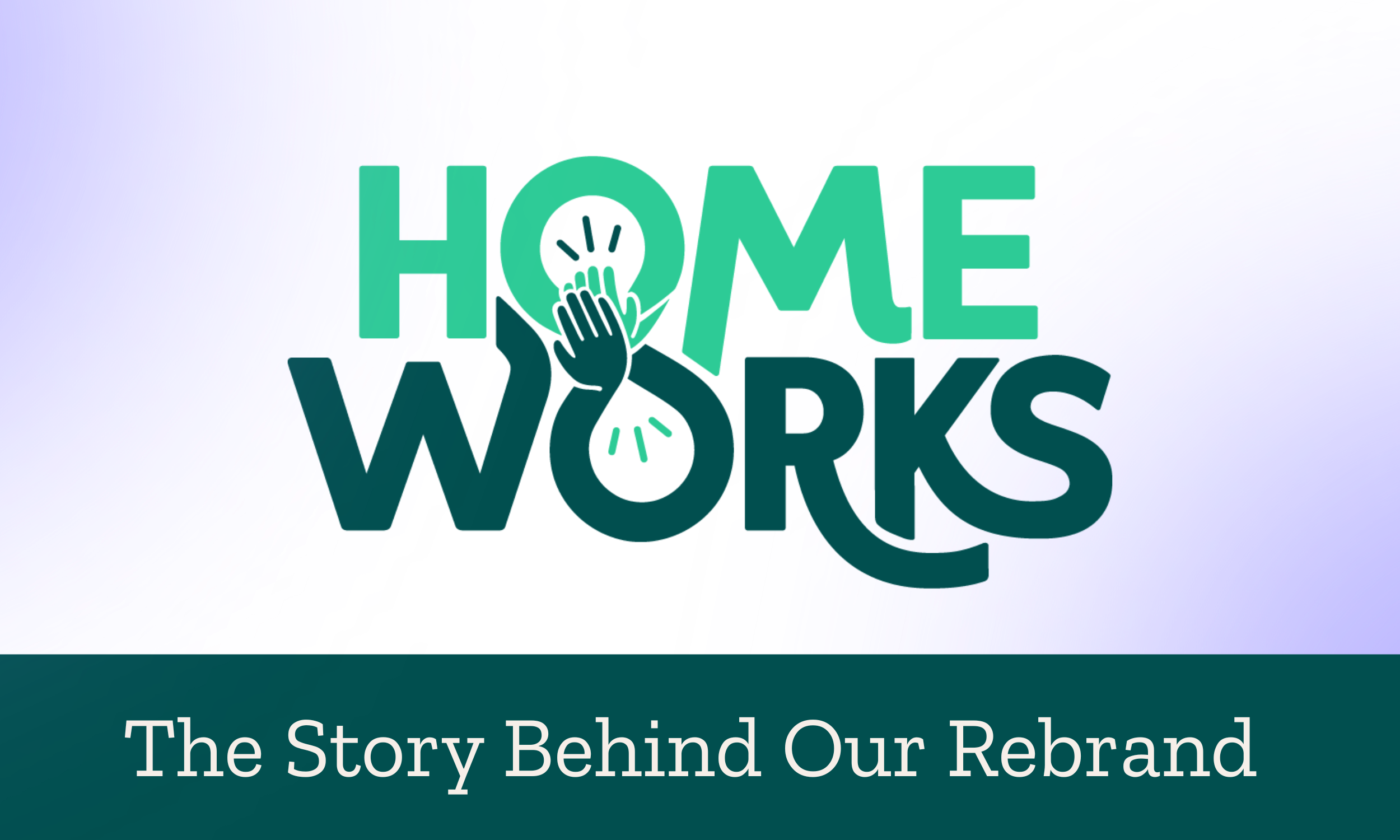
When we began imagining our new logo, we wanted something fresh and modern, but more importantly, something that truly represents what we do. That’s how we arrived at the high-fiving infinity loop.

The high five represents the teamwork and collaboration that happens between school and home, while the infinity loop symbolizes the continuous learning and support a child experiences throughout their life as a result of those relationships.

And yes, even though we dropped the exclamation point, we are just as enthusiastic about our work as ever!
Along with our new logo, you’ll notice a new color palette and fonts, all chosen to reflect and complement our guiding pillars.
Reimagining Our Website
Alongside our new visual identity, we also reimagined our website - and introduced a new domain, teamhomeworks.org, that speaks to the spirit of collaboration that roots our program.
Teachers are the heart and soul of our program. Without their dedication and participation, none of what we do would be possible. We knew our website needed to truly speak to educators in a way that is relevant, clear, and meaningful.
In a world where standards, curriculum, and best practices are constantly changing, and there never seems to be enough hours in the day, we wanted to create a space where teachers could access current, easy to read data that clearly shows the real impact of our program.
While the site was designed with educators at its core, it also reflects the broader Home Works community - families, partners, funders, and supporters who make our mission possible.
Our blog and resource pages are wonderful examples of this, spaces where we’ll share practical, real world tools and tips to help educators and families work together. Our program makes such an impact, and we wanted to make that impact more accessible, even to schools we aren’t serving…yet!
Looking Ahead
This rebrand reflects more than just a new logo and color palette. It represents growth, clarity, and renewed energy - a visual identity that better represents the powerful relationships at the core of our mission.
We’re so proud of what we’ve created and are very excited to share it with you. We hope you’ll explore our new site, discover the resources available, and continue to be part of the journey as we strengthen connections between school and home for student success.